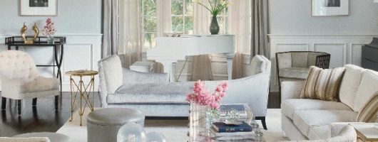
As previously reported, Veranda Magazine featured Jennifer’s LA home and interviewed her interior designer, Michelle Workman. Workman remodeled Jennifer’s Los Angeles home over a nearly 3 month period in 2010. Check out some additional images below and continue reading for an excerpt from the magazine, which is on newsstands now.
[nggallery id=19]
Text and photos courtesy of Veranda Magazine.
Here’s an excerpt from the magazine, which is on newsstands now.
Jennifer Lopez knows a thing or two about red-carpet glamour. But at her California residence, a different, more serene glamour prevails. In the foyer, a dramatically sweeping staircase greets visitors. Beneath, a lunette sofa graciously invites them to stay. A white lacquered piano makes a striking statement in the living room, but it’s the ethereal blue-grays, velvet sheens and shimmering silvers that truly captivate. In the pale mauvedining room and pastel peach guest bedroom, crystal and blown-glass chandeliers gleam like pieces of jewelry.
“It’s sort of Jennifer in a nutshell—she has a romantic streak,” says interior designer Michelle Workman of her multi-talented client, who becomes a judge on American Idol this winter. “It’s tastefully glamorous, like Jennifer herself. That approach goes along with my whole design philosophy, which is about capturing the personalities of the homeowners.”
Workman, who enhanced the allure factor by adding Art Deco touches throughout the house, says the key to keeping everything in balance is the subtle gradations of color across the generously scaled rooms.
“There are all these tones of gray, and we played with that—using a bit more of a gray-taupe here, a bit more of a gray-blue there,” says Workman. “It’s almost like a black-and-white film from the forties.”
And to think that most of the decoration of the house was pulled off in just over ten weeks, an unheard-of feat for most design jobs. Workman had nearly completed a château-inspired house for Lopez when the singer-actress had a change of heart—she didn’t want to be locked into a classically French look.
“Jennifer wanted to go modern and streamlined but retain the sophistication and stylishness,” says Workman.
In less than three months, the designer reimagined the new house’s living room, kitchen, family room, bedrooms and baths. Soon afterward, she completed other spaces, including a movie screening room, a music studio and a game room.
While many rooms feel feminine, the family room hits a masculine note. “It’s a comfortable space that invites you to come in and kick off your shoes.”
Lopez made design decisions with confidence, Workman says. “She expects you to be fast, and she’s fast in getting back to you. So often with clients, you are waiting and waiting for approvals. But not Jennifer. She knows what she likes.”
In another designer’s hands, all of the grays and blues could feel like a cold draft. Workman chose fabrics such as silk, velvet and leather that have a highly tactile and welcoming character. She used chandeliers that warmly reflect light. She also added brass and bronze accessories to raise the temperature in the rooms.
“I love to mix gold and silver tones. It’s warm and cool together. Gold is traditional, and silver is modern and sleek. It’s a great marriage of feminine and masculine.
“Jennifer and I wanted elegance, but we didn’t want it to look stuffy or conservative or serious,” says Workman. “We wanted it to be graceful, with just enough sparkle.”
Call it glint over glitz.
INTERIOR DESIGN BY MICHELLE WORKMAN
PRODUCED BY ANNE FOXLEY


